Work Simulation for HCI
-
Home
- The work simulation is series of tasks designed to give you the experience of working in HCI.
- You will be presented with ten ‘to-do’ lists of tasks. Most of the tasks you will respond to using the portfolio facility on GCU Learn (Blackboard).
- The module also has learning resources including lectures and exercises that will help you learn about HCI and to complete the business simulation tasks.
- Please read the case study document to find out more about the work simulation
-
Getting Started
First Steps
Decision Tree
- Look at each of the decisons, testing first what you think is best and then what you think might not be helpful
Start
- You have been asked to produce a design for a downloadable app for a garment manufacturer wishing to sell fabrics anywhere in the world
What is your first step?Apps
- Highly specialised manufacturer based sales apps aren’t that common they tend to do business via a web site expecting that their clients are other business which will have access to PCs.
Client
- Clients frequently don’t have a great deal of knowledge about technology – you will have to be more precise…
Web Sites
- Web sites tend to provide a complete catalogue with a lot of information.
Client Web Site
- The client’s web site is set up to sell to other businesses.
Success
- You find out that the client wants to sell directly to the customer not just to other business – this is important as it is the customers requirements that you will be designing for.
Asking about the users is probably the best starting point as you are focusing on who will be using the app.Submit using 'My Portfolio' the following:
- ● Job Application
- ● Explanation of the decision tree
To-do List One
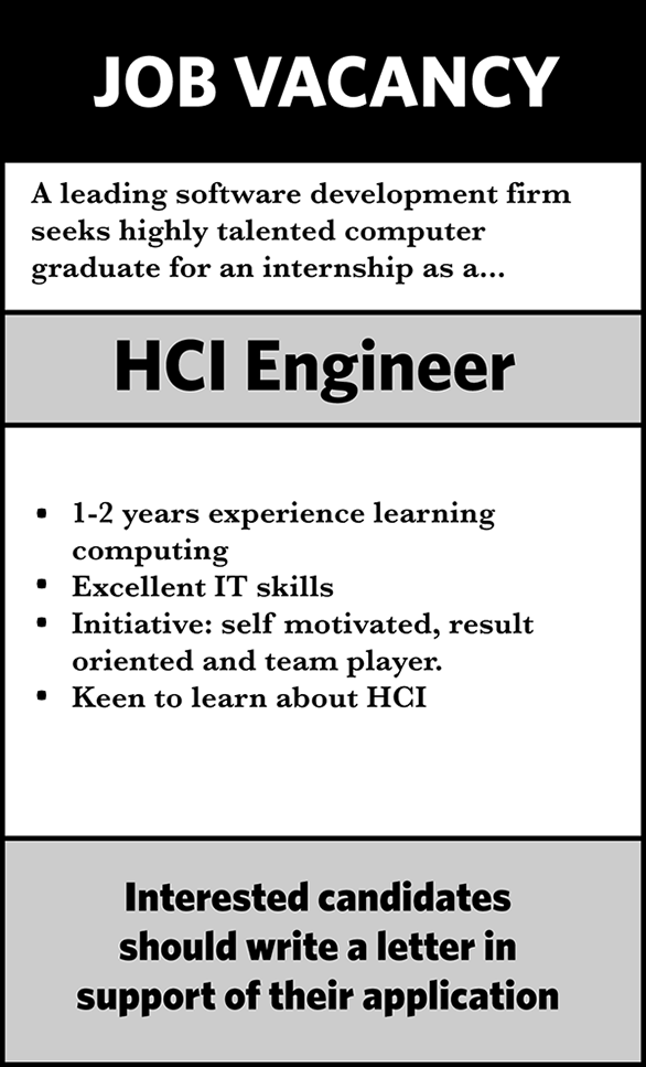
- ▣ View job advert
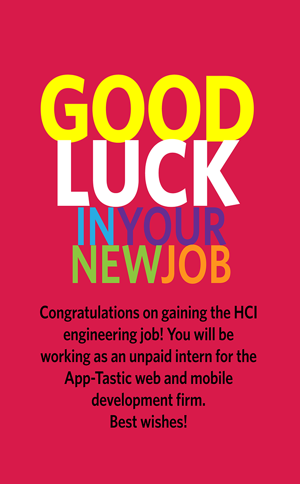
- ▣ View job confirmation
- ▣ Examine decision tree - ‘first steps’
- ▣ Submit for Assessment
-
Requirements
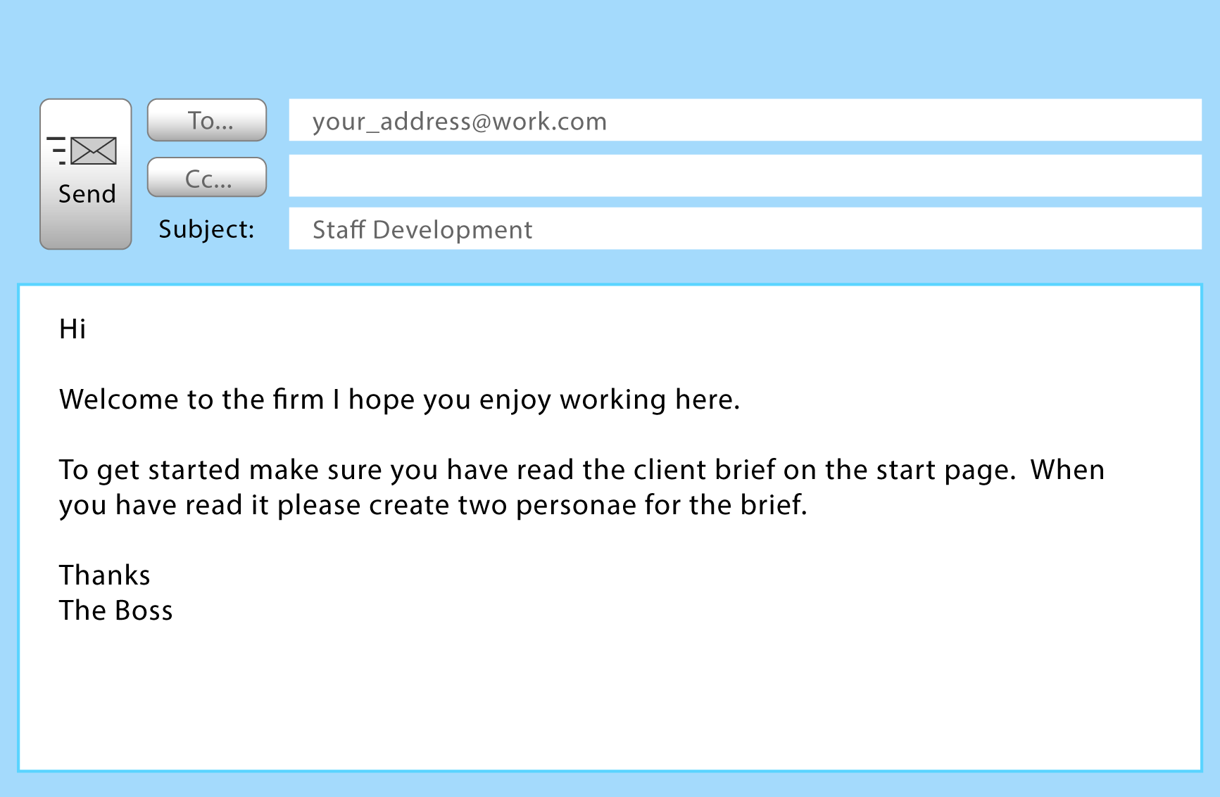
Submit using 'My Portfolio' the following:
- ● Persona
- ● Scenario
- ● Explanation of the decision tree
Function & Non-Functional Requirements
Decision Tree
- Look at each of the decisions, testing first what you think is best and then what you think might not be helpful
Start Question
- Your requirements list should contain both functional and non-functional requirements. Thinking about requirements in this way can help you to create a more comprehensive list. The client wants a colourful visual identity, is this
Correct
- Correct – while visual identity is undoubtedly important it is not part of the function of the site.
Wrong
- Wrong – visual identity is not a function of the app i.e. you wouldn’t expect to see it as a menu item or button
Wrong
- Wrong – a search facility is a function that the use can interact with
Correct
- Correct – a product listing is a function of the app where a user might select this as a menu item.
Wrong
- Wrong – a product listing is a function of the app where a user might select this as a menu item.
Correct
- Correct – security is not a specific function of an app where a user might select this as a menu item.
Wrong
- Wrong – security is not a specific function of an app where a user might select this as a menu item.
Fifth Question
- The client wants the user to be able to authenticate as a registered user, is this
Requirements End
- Success You should now write a definition of functional and non-functional requirements using the questions to help you and put the definition in your simulation portfolio.
-
Prototyping
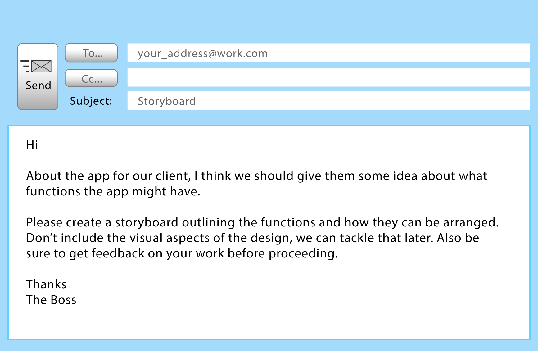
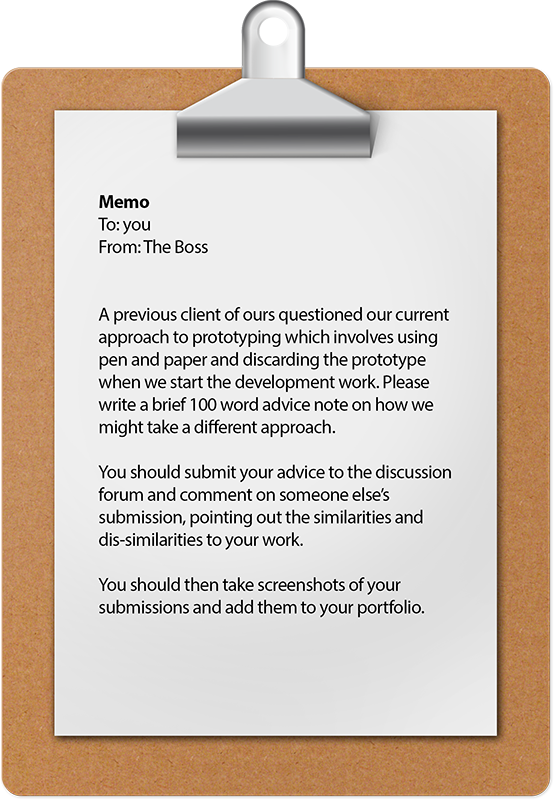
Submit using 'My Portfolio' the following:
- ● Explanation of the decision tree
- ● Storyboard
Prototyping
Decision Tree
- There are not always clearly right or wrong answers – just strengths and weaknesses – explore the tree to help you think about the circumstances when each option will be most effective.
Start
- You have been asked to produce a downloadable app for a garment manufacturer wishing to sell fabrics anywhere in the world. If you were asked to communicate your design ideas early in the project would you…..
Prototyping
- Prototyping Is an effective way of communicating your design ideas. It give the client something concrete to look at helps the designer try out new ideas.
Trial and Error
- Trial and error implies that you are going to spend time and money creating a complete app. If the client wants substantial changes you may have to discard a great deal of work. However if you already have a similar app you can use it as a template for the new one, thus actually saving time and money.
Fidelity
- Given a situation where you had to produce a prototype quickly for a client which would you choose?
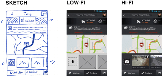
Lo-Fi
- Lo-fi prototypes are quick and easy to make as they lack the detail present in Hi-fi. However if the client wants clarity instead of speed Hi-fi is better.
Hi-Fi
- Hi-fi prototypes usually take longer to produce than lo-fi. However they can help the designer to communicate more complex ideas with grater clarity.
Limiting Functionality
- Prototypes by their nature have limited functionality, however it is possible to be strategic about how to organise functionality. Given a situation where the client is unclear about exactly what they want i.e. they want you to help them decide, which of the following would you choose?
Horizontal
- Horizontal prototypes typically have functionality spread across a range of functions but with none of them working fully. This can lead to a clearer overall picture for the client.
Vertical
- Vertically limited prototypes will tend to have one or two categories of function working, e.g. authentication or order processing. This approach can be useful if you are trying to innovate in one particular area and want to be clear with the client what you are trying to achieve.
Prototype and client
- The approach you take to working with the client is extremely important. Given a situation where you are working with a client who has previously worked on an app and is very clear about what they want, which of the following would you choose?
Designer Led
- It is usually appropriate for the designer to lead the prototype development process when the client is unsure about what options are available to them and how they might be organised. However it is usually preferable to collaborate with the client/users as early on in the design process as possible.
Collaborative with Client/Users
- Enabling the client/users to be involved in the design process can lead to more responsive design and enable you to save time and effort by not having to work on feature the client/users are not interested in using.
Prototype Type
- Given a situation where creating a finished project quickly is of high importance which of the following would you choose?
- Evolutionary
- An evolutionary prototype is where the prototype develops into the finished project. This approach is usually most effective where time is on he essence.
Throw-away
- A throw-away prototype is not used as part of the finished project. This type of prototype works best when it is imperative that the design matches the analysis completely and that this can be validated early on in the process.
The End
- Success When deciding what to do about prototyping there aren’t any clear instructions about what approach to take. You have to decide what will be the most effective approach to helping you arrive at the app the client wants.
To-do List Three
- ▣ Examine decision tree - ‘prototyping’
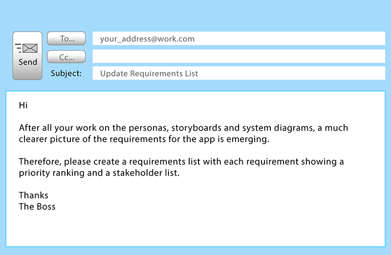
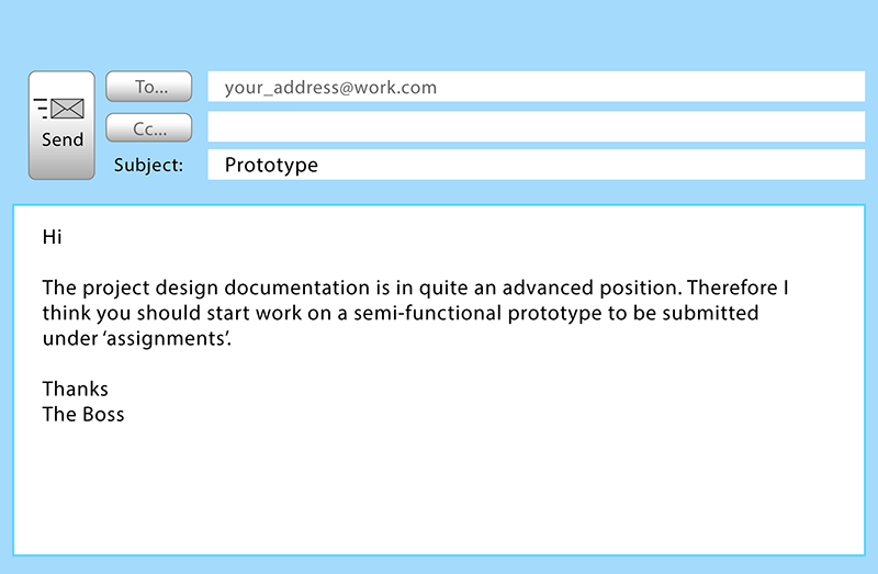
- ▣ View email from the boss
- ▣ Submit for Assessment
-
Design


Visual Design in Mind
Decision tree
- We are looking at key design decisions that are intended to help you think more creatively about your visual design. There aren’t really any ‘wrong’ decisions as such rather there are a series of ideas which may help you to approach the task more successfully.
Anyone can design
- Imagine you have been asked to create the visual design for a sports wear web site. You have come up with the idea of featuring trainers (shoes) prominently in the design. What do you do next?
Decisive

- Ok, you have a visual starting point. However you should bear in mind that designers are usually quite open minded about designs particularly when they are starting a project, don’t be afraid to change your mind. As you are settled on the ‘trainers’ idea it is time to work it in to the elements of a design – do you want to
Procrastinate
- OK, you are hoping to come up with a better idea than the ‘trainers’. Good designers (and original thinkers) frequently procrastinate. Keeping an open mind can be useful. However it might also be useful to help the process by creating a mood board – this can be as simple as a word document with screen shots, images, fonts and colours that you think might work for your design
Activity Mood Board
- Associations = Fitness, health, activity, play, competition
 You have added a range of images to your mood board
Trainer Mood board
- As you are currently working on trainers it would be useful to think about how that could influence your design. To do this you should create a mood board – this can be as simple as a word document with screen shots, images, fonts and colours that you think might work for your design. Here are the images currently in your mood board.
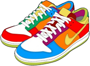
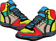
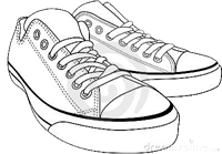
Update from client
- Your client has clarified that they want a bright vibrant design that promotes the ideas of activity
Activity Mood Board Update
- Good news, your mood board does cover the idea of activity, but it isn’t bright or vibrant. So what do you do?
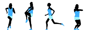
Trainer Mood Board Update
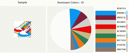
- Good news, your mood board has bright and vibrant images, but a pair of empty trainers isn’t very active. So what do you do next?
The End
- Success! You have some colourful activity related images to work with.
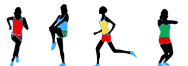 This decision tree is intended to be fun, but it does have a serious point to make. Reflect on what that might be and put your answer in your portfolio
Submit using 'My Portfolio' the following:
- ● Explanation of the decision tree
- ● Submit diagrams
To-do List Four
- ▣ Examine decision tree - ‘design’
- ▣ View email from your boss
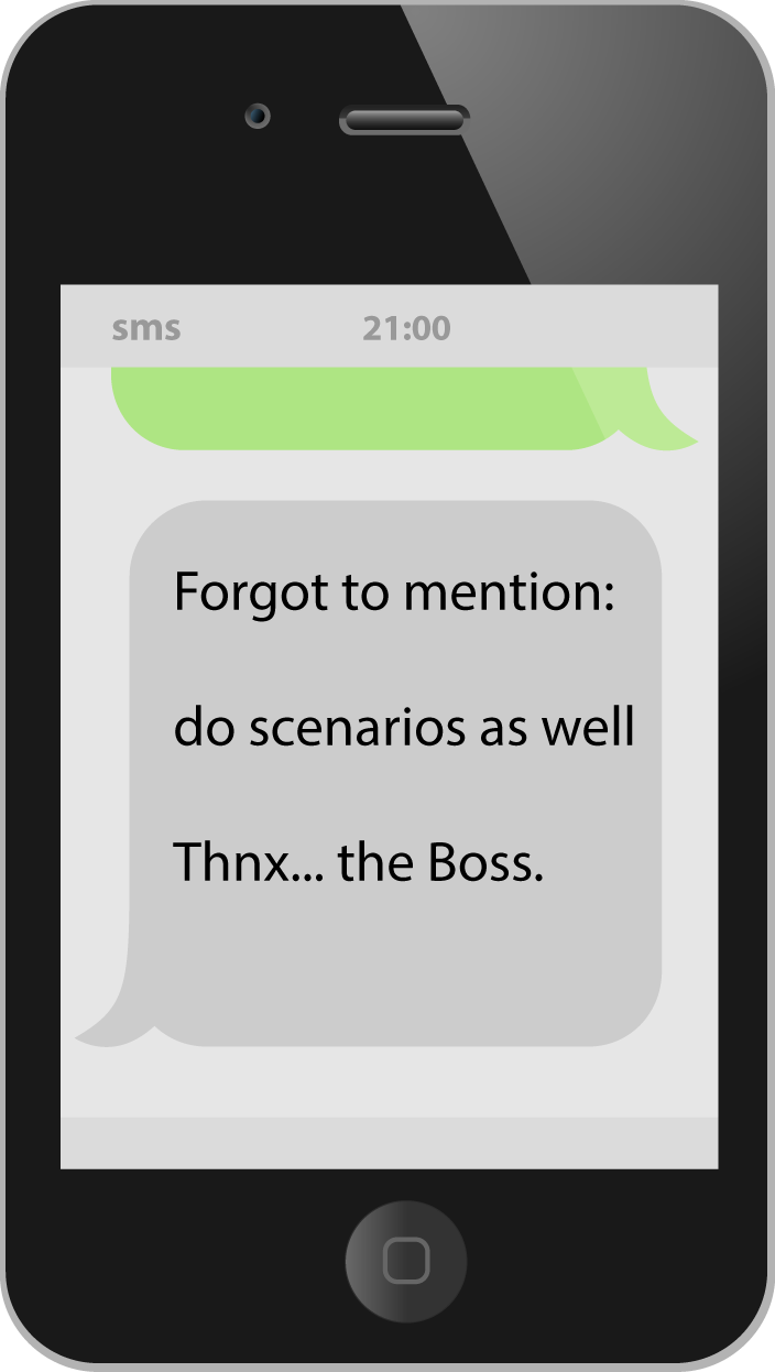
- ▣ View sms from the boss
- ▣ Submit for Assessment
-
Human Factors
-
Accessibility & Usability

Instructions
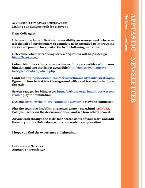
This game is designed to simulate cognitive disability to give the player a small insight into what it might be like to navigate a complex web site if you had such a disability. You are going to be shown a page divided into a game to play and a web site. The idea is to play the game navigating the ‘player’ using the ‘up’, ‘down’ etc. buttons without crashing. At the same time you should attempt the tasks using the web site. Good luck! This game may take a while to load.Submit using 'My Portfolio' the following:
- ● Screen shots from accessibility game
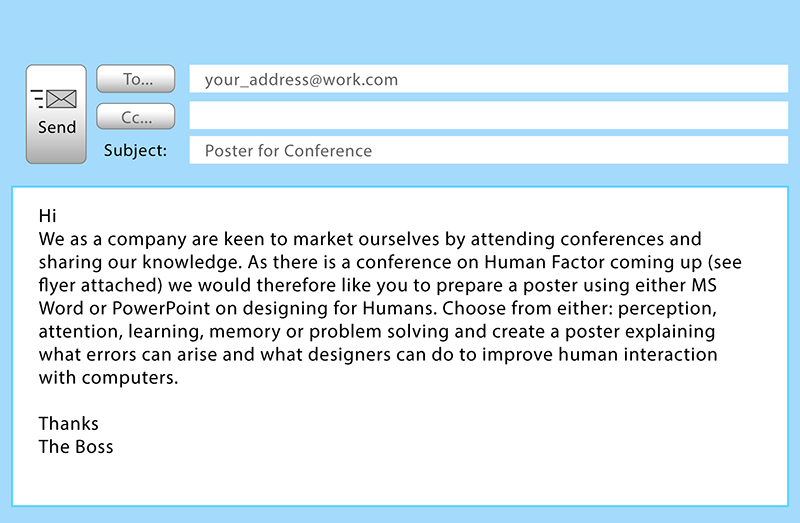
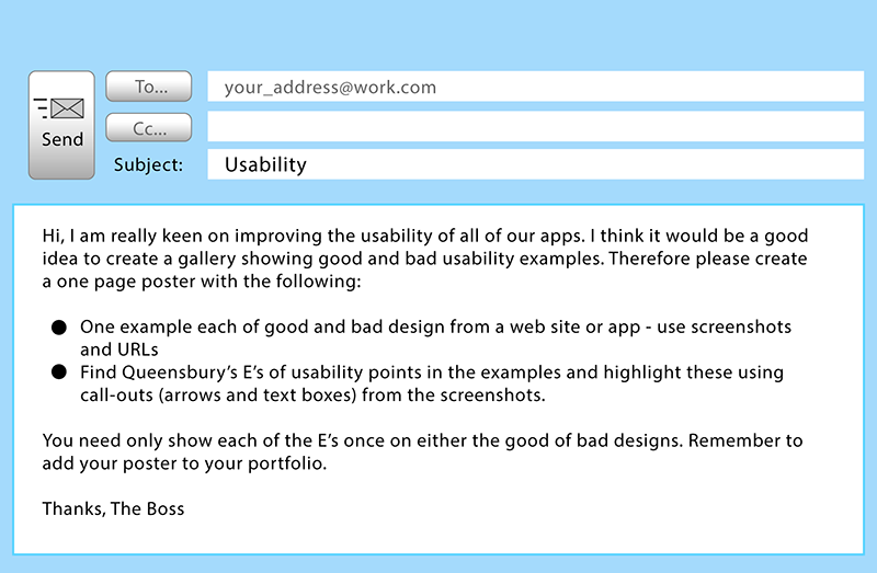
- ● Usability Poster
-
Boss Away
Submit using 'My Portfolio' the following:
- ● Screen shot from ethics game showing 100% success
-
Evaluation & Observations
Submit using 'My Portfolio' the following:
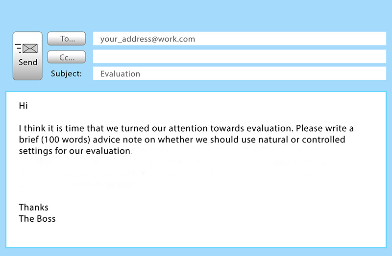
- ● Advice note
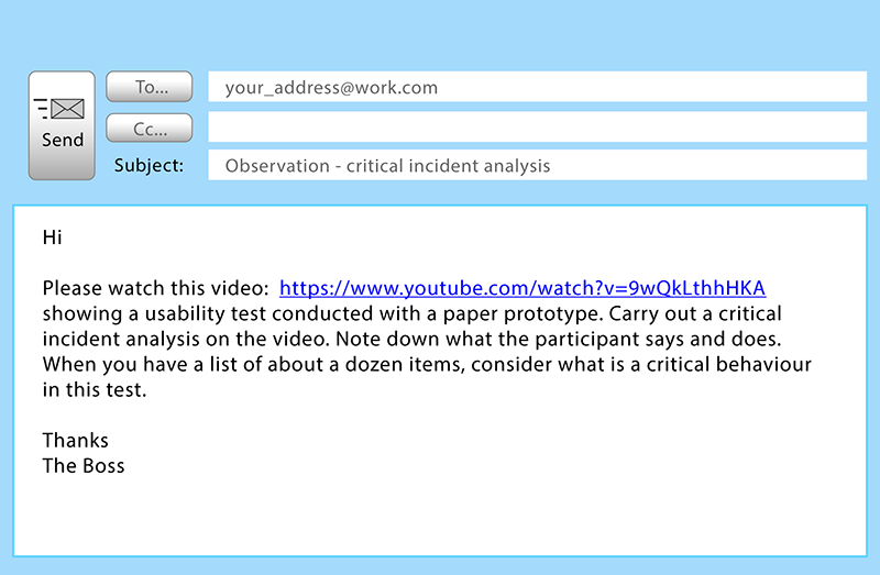
- ● Observation task
