01
-
Simple static website
- A basic website consists of
- A group of static pages
- written in html
- styled using css
- linked together
- using basic html hyperlinks
- uploaded onto a server
- accessed using a web browser
- Static sites consist of pages with fixed content displays the same information to every visitor .The page content established at the time page is created. They are useful for displaying data that doesn’t change often and are cheap to develop and host. However web developer skills needed to update page and they can become out of date easily.
-
Styling a website
- A css document can be attached to the head section of the html document and is used to style individual elements such as
- tags
- <body>
- <header>
- <section>
- <h1>
- can also be used to style sections of the page using class and id attributes e.g.
- class="textArea
- id="picture"
- code to attach style sheet
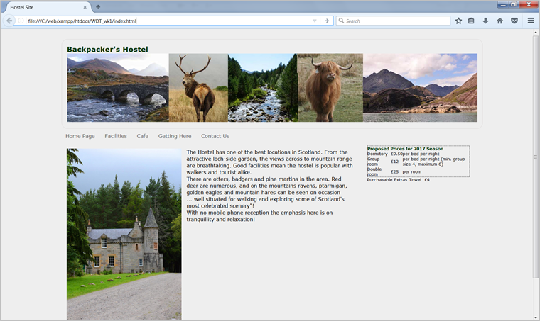
<head>
<meta http-equiv="Content-Type" content="text/html; charset=utf-8">
<title>Hostel Site</title>
<link href="hostelStyle1.css" rel="stylesheet" type="text/css">
</head>
- code for style sheet
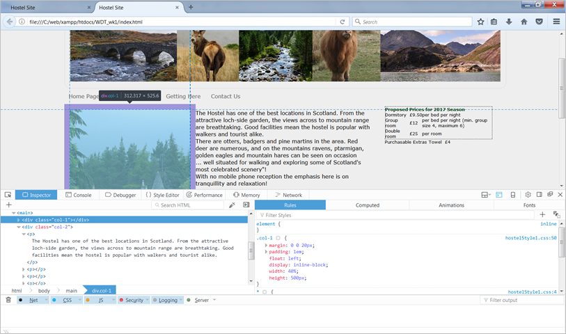
- Modern browsers such as Chrome or Firefox provide a range of developers tools which make it easy to see how styles are being applied. Right click on the page and choose Inspect or Inspect element. This will bring up a panel which shows the html code and one with the associated styles.
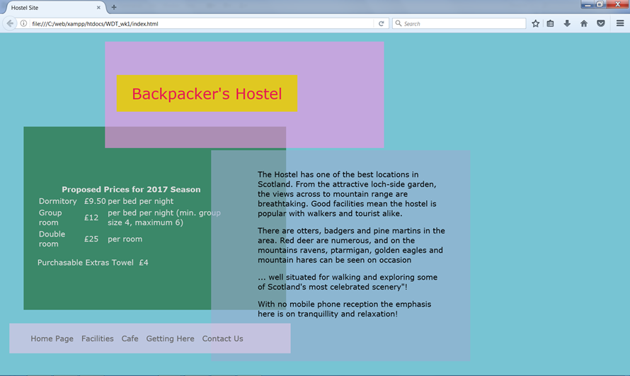
- It is easy to change the look and feel of an entire site simply by changing the stylesheet. For example changing the stylesheet in the example above from hostelStyle1.css to hostelStyle2.css completely changes the page displays without having to touch the html
- Note the code for these examples is available for you to experiment with in the Try it yourself section further down the page.
- Correctly constructed external CSS
- simplify site development and maintenance
- ensure accessibility
- facilitate cross browser compatibility
- allow changes to look and feel without touching the content
- allows progressive enhancement and responsive design
-
Creating websites
- static sites
- html
- css
- dynamic sites
- html
- css
- php (or similar server-side language)
- javascript (or similar client-side language)
- increasingly sites are not written from scratch but make use of
- content management systems
- templates
- code libraries
- and frameworks to generate pages
Content Management Systems
- designed to allow users with little knowledge of web programming to create and manage website content
- administration is carried out using a browser-based interface
- content is separate from design
- site owner/staff can add content and edit pages
- no technical knowledge is needed
- content is added using a browser-based interface
- page content is stored in a database
- look and feel of the site is controlled by templates
- templates provide the “presentation layer”
- templates are typically use xml and php to specify page layout
- pages are then styled using css
- templates and css can be altered and customised
- the ease with which this can be done varies between applications
- Code libraries such as jQuery are collections of pre-written code which means that developers do not need to keep rewriting code for common functionality. They takes common tasks that require many lines of JavaScript code and wraps them into methods that can be called with a single line of code. Frameworks provide fixed structures inside which applications can be developed. They tend to be more rigid than code libraries. You will study more about frameworks later in the module.
-
Responsive Design
- Modern websites are viewed from phones, tablets, laptops, desktop computers on screens which vary enormously in both shape and size. A website must be designed to display well on any type of screen.
- Using the following three techniques will help to make you sites responsive and able to display across a range of screens
- fluid layouts
- flexible images (and media objects)
- CSS media queries
Fluid layouts
- uses relative units instead of fixed units
- typically use percentages instead of pixels, but any relative unit of measurement will work, such as ems.
- will fill the width of the page, no matter what the width of the browser might be.
- some drawbacks at very large or very small browser widths.
- if the browser is very wide, some content might be stretched too far.
- on large screens, a single paragraph might run across the page on a single line
- conversely, a multi-column layout on a small screen could be too crowded for the content.
Flexible images
- use percentages of the overall width of the page.
- For example,
- an image with a natural size of 500px × 300px in a 1200px wide document.
- Below 1200px, the document will be fluid.
- Above 1200px
- calculate how much width the image takes up as a percentage of the document
- (500 / 1200 ) × 100 = 41.66%
- can run into issues at extremes of large or small viewport sizes,
- use a max and/or min width on the image in pixels as upper and lower limits
<img src="mount-mayon.jpg" alt=“Mount Mayon, Phillipines“> # mayon { float: right; width:41.66%; margin-left:2rem; max-width:500px; }- CSS media queries adapt the design to fit different screen sizes. You need to
- find out the physical characteristics of the devices which are commonly used to display the site
- chose breakpoints to allow the layout to change to accommodate different screen sizes
- Media queries can either be used in html document to link to separate stylesheets or can be used within stylesheets.
- Media query linking to different style sheets from inside an html document
<link rel="stylesheet" type="text/css" media="screen and (max-device-width: 480px)" href="smallScreen.css" />
- Media query inside a stylesheet which is only applied if a screen is smaller than 600px
@media screen and (max-width: 600px) {
   .class {
       background: #ccc;
    }
}