-
Steps in Data Science Process
Data scientists follow various process to unveil information from data and provide insights in fields. In this module, we adopt a simple linear form of data science process (as illustrated below), which include five basic steps: data acquire, data prepare, data analyse, report and act.
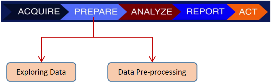
In the data acquire step, raw data are imported into your analytics platform. Then you should prepare your data for analysis. Data preparing can be divided into data exploring and data pre-processing. Various models can be applied for data analysis. Finally, the results of the investigation should be presented to the public or internal consumers of information in a way that makes sense and can be used by stakeholders.
In a practical scenario, this process is rarely linear. Each step can push data scientists back to previous steps before achieving the final goal, forcing them to revisit the methods, techniques, or even the data sources.
In the following, we will concentrate on the data preparing and data analysis steps.
-
Exploring data - Correlations
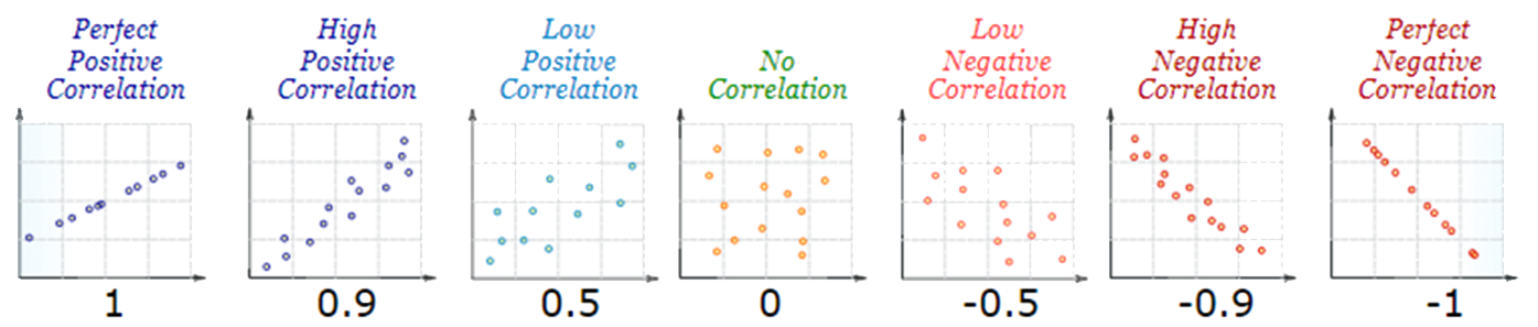
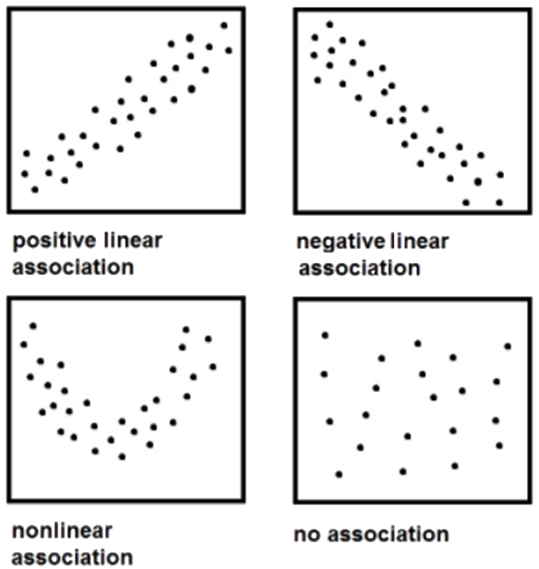
In the broadest sense, correlation is any statistical association. In common usage it can show whether and how strongly pairs of variables are to having a linear relationship with each other. Positive Correlation indicates the extent to which those variables increase or decrease in parallel; Negative Correlation indicates the extent to which one variable increases as the other decreases.
- Correlations can have a value - Correlation Coefficient $r$ :
- $r = 1$ means a perfect positive correlation
- $r = 0$ means no correlation (the values don't seem linked at all)
- $r = -1$ means a perfect negative correlation
the value shows how good the correlation is:
For example, a local ice cream shop plot how much ice cream they sale versus the temperature on that day, and got the following scatter plot:
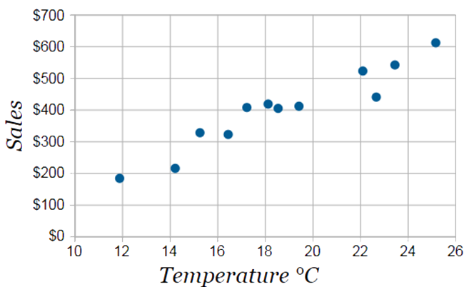
We can see that weather and sales increase together: there is a high positive correlation between these two variables.
The correlation between variable $x$ and $y$ can be calculated using a formula:
$$r_{xy} = \frac{\sum_{i=1}^{n} (x_i - \hat{x})(x_i - \hat{y})}{\sqrt{\sum_{i=1}^{n}(x_1 = \hat{x})^2 \sum_{i=1}^{n} (y_i - \hat{y})^2}}$$
Where $n$ is the number of $x$ or $y$ values,
$\sum$ is Sigma, the symbol for "sum up",
$(x_i - \hat{x})$ is each $x$-value minus the mean of $x$
$(y_i - \hat{y})$ is each $y$-value minus the mean of $y$.
Or you can just make a Scatter Plot, and look at it to get a rough idea about the correlation.
Correlation is NOT causation! i.e., a correlation does not prove one thing causes the other. One classic example is about ice cream and murder:
The rates of violent crime and murder have been known to jump when ice cream sales do. But, presumably, buying ice cream doesn't turn you into a killer.
-
Exploring data – Outliers
An outlier is an observation that lies an abnormal distance from other values in a random sample from a population. An outlier may be due to variability in the measurement or it may indicate experimental error. An outlier can cause serious problems in statistical analyses and data analyses.
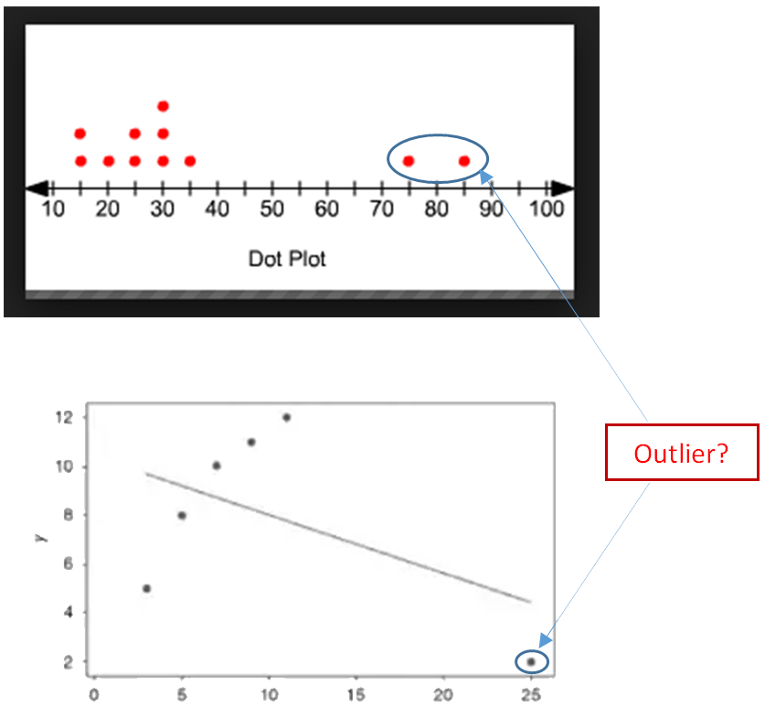
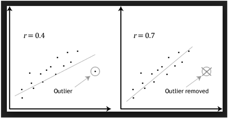
In a sense, the definition of outlier leaves it up to the analyst to decide what will be considered abnormal. There is no precise way to define and identify outliers in general because of the specifics of each dataset. Instead, you, or a domain expert, must interpret the raw observations and decide whether a value is an outlier or not. Nevertheless, the following statistical methods can be used to identify observations that appear to be rare or unlikely given the available data.
1. Box plots or box and whisker plots
Those plots provide a graphical depiction of data distribution and extreme values and can be used as an initial screening tool for outliers as they2. Probability plots
This type of plot is used for graphically displaying a data set’s conformance to a normal distribution. It can be used as an initial screening tool for outliers as they3. Dion’s test
It evaluates a single suspected outlier by computing a test statistics. If the test statistic is greater than the critical value, the suspected outlier is confirmed as a statistical outlier.4. Rosner’s test
This test helps to identify multiple outliers in a data set with at least 20 normally-distributed values. -
Exploring data – Summary statistics
Summary statistics gives a quick and simple description of the data. Summary statistics can include:
1. Mean
The average of all numbers and is sometimes called the arithmetic mean. $$\hat{x} = \frac{1}{n} \Big(\sum_{i=1}^{n}x_i \Big) = \frac{x_1 + x_2 + \cdots + x_n}{n} $$2. Median
The statistical median is the middle number in a sequence of numbers.
To find the median, organize each number in order by size; the number in the middle is the median.3. Mode
The number that occurs most often within a set of numbers.
Mode helps identify the most common or frequent occurrence of a characteristic. It is possible to have two modes (bimodal), three modes (trimodal) or more modes within larger sets of numbers.4. Range
The difference between the highest and lowest values within a set of numbers.
To calculate range, subtract the smallest number from the largest number in the set:
Range = Maximum – Minimum5. Standard derivation $\sigma$
Standard derivation is a measure used to quantify the amount of variation or dispersion of a set of data values: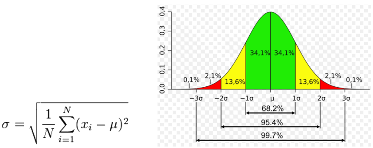
Where $u$ is the mean of the variable $x$.A low standard deviation indicates that the data points tend to be close to the mean (also called the expected value) of the set; a high standard deviation indicates that the data points are spread out over a wider range of values.
-
Exploring data - Visualisation
Histogram
A histogram is a graphical display of data using bars of different heights. It is similar to a Bar Chart, but a histogram groups numbers into ranges (bins), then count how many values fall into each interval. The bins must be adjacent, and are often (but are not required to be) of equal size.
Histograms give a rough sense of the density of the underlying distribution of the data. It is an estimate of the probability distribution of a continuous variable (quantitative variable).
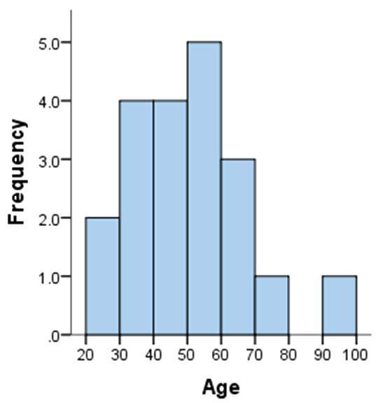
For example, you have 20 data as listed in the table below:
36 25 38 46 55 68 72 55 36 38 67 45 22 48 91 46 52 61 58 55 Split them into 8 bins, with each bin representing an interval of 10 starting from 20. Each bin contains the number of occurrences of scores in the data set that are contained within that bin. For the above data set, the frequencies in each bin have been tabulated along with the scores that contributed to the frequency in each bin (see below):
Bin Frequency Scores Included in Bin 20-30 2 25,22 30-40 4 36,38,36,38 40-50 4 46,45,48,46 50-60 5 55,55,52,58,55 60-70 3 68,67,61 70-80 1 72 80-90 0 - 90-100 1 91 Plotting the frequency against the bin, you got the histogram:
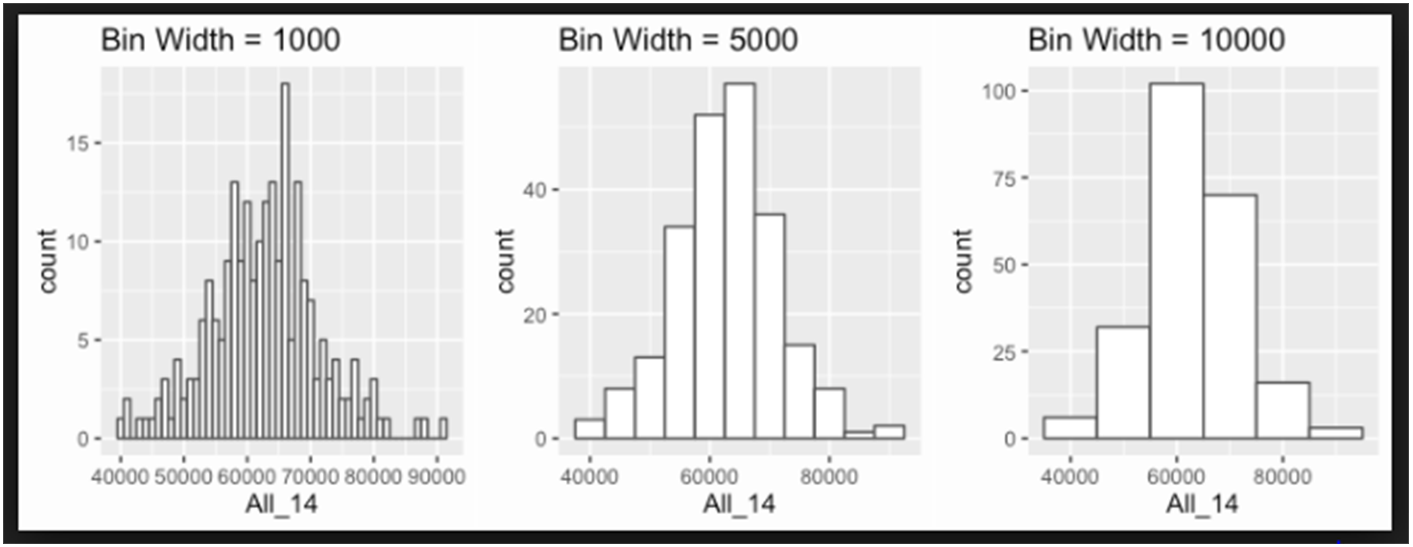
There is no right or wrong answer as to how wide a bin should be, but there are rules of thumb. You need to make sure that the bins are not too small or too large. The following histograms use the same data, but have different bins:
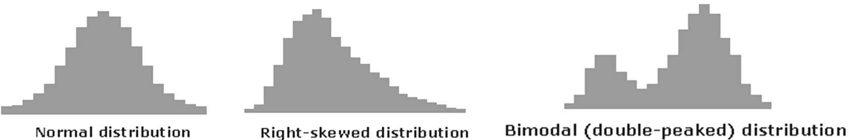
Histogram can have different pattern. Some examples are shown below. When a distribution differs from the expected shape, the underlying process should be examined to find real causes of this.
Scatter plots
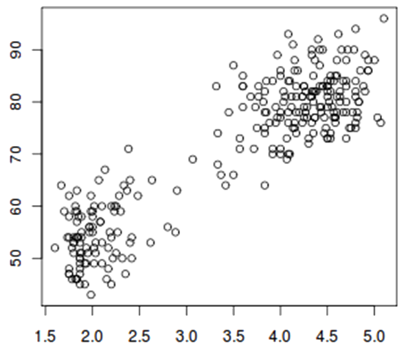
A scatter plot is a two-dimensional data visualization. Data points are plotted on a horizontal and a vertical axis in the attempt to show how much one variable is affected by another. If the points are color-coded, one additional variable can be displayed. A scatter plot can suggest various kinds of correlations between variables with a certain confidence interval. For example, the scatter plot below suggests the data could be grouped into two clusters.
As used in section Exploring data - Correlations, scatter plots can be used to visualise correlations between variables.
-
Data Pre-processing overview
Data preparation is a very important part of the data science process. In fact, this is where you will spend most of your time on any data science effort. Data pre-processing can be a tedious process, but it is a crucial step. Always remember, “garbage in, garbage out”. If you don't spend the time and effort to create good data for the analysis, you will not get good results no matter how sophisticated the analysis technique you're using is.
Two major aims to be achieved in data pre-processing:
1. To clean the data to address data quality issues, which includes
Missing values
Invalid data
outliers
Domain knowledge is essential to making informed decisions on how to handle incomplete or incorrect data.2. To transform the raw data to make it suitable for analysis, which includes
Scaling
Transformation
Feature selection
Dimensionality reduction
Data manipulation -
Data Pre-processing – Missing values
In statistics, missing values occur when no data value is stored for the variable in an observation. Missing data are a common occurrence and can have a significant effect on the conclusions that can be drawn from the data.
Types of missing values
- When considering the potential impact of the missing data on data analysis, it is important to consider the underlying reasons for why the data are missing. Missing data are typically grouped into three categories:
- Missing completely at random (MCAR)
When data are MCAR, events that lead to any particular data-item being missing are independent both of observable variables and of unobservable parameters of interest, and occur entirely at random.
In these instances, the missing data reduce the population of the study and consequently, the statistical power, but the analysis performed on the data is unbiased: when data are MCAR, the data which remain can be considered a simple random sample of the full data set. MCAR is generally regarded as a strong and often unrealistic assumption. - Missing at random (MAR)
When data are MAR, the data are missing is systematically related to the observed but not the unobserved data. - Missing not at random (MNAR)
When data are MNAR, the fact that the data are missing is systematically related to the unobserved data, that is, the missingness is related to events or factors which are not measured by the researcher.
Handling missing values
If the number of missing values is extremely small: less than 5% of the sample, you can drop or omit those values from the analysis.
If the number of missing values is large, in the case of multivariate analysis, it can be better to drop those cases. On the other hand, in univariate analysis, imputation can decrease the amount of bias in the data, if the values are missing at random.
- Common methods for data imputation include:
- Mean imputation
- K-nearest neighbours (KNN) imputation
- fuzzy K-means (FKM) imputation
- singular value decomposition (SVD) imputation
-
Data Pre-processing – Invalid data & outlier
Invalid data
A value is invalid if it is inconsistent with your input statement. For example, it does not conform to the format specified, not match the input style used, or it is out of range (too large or too small).
- Invalid data can be grouped into three categories:
- Official missing data values
- Invalid values that provide no information regarding true value
- Invalid values that suggest true value
The problem of invalid data will typically be transformed into one of missing data.
Outlier
Outliers could be just meaningless aberrations caused by measurement and recording errors, but they could also be Extreme Values containing valuable information. So it is important to question and analyse outliers in any case to see what their actual meaning is.
Why are they occurring, where, and what might the meaning be? The answer could be different from case to case, but it’s important to have this investigation rather than to simply ignore them.
-
Data Pre-processing – Scaling and Normalization
Scaling
Scaling or Min-Max scaling is a method used to standardize the range of independent variables or features of data. It scaling features to lie between a given minimum and maximum value, e.g. scaling feature to lie between zero and one, so that the maximum absolute value of each feature is scaled to unit size.
In statistics, scaling usually means a linear transformation:
$$f(x) = ax + b.$$
In some machine learning algorithms, objective functions will not work properly without normalization. For example, methods based on measures of how far apart data points, like support vector machines (SVM) or k-nearest neighbors (KNN). With these algorithms, a change of "1" in any numeric feature is given the same importance. If one of the features has a broad range of values, the distance will be governed by this particular feature. Therefore, the range of all features should be normalized so that each feature contributes approximately proportionately to the final distance.
Normalization
Scaling just changes the range of your data. Normalization, also called Z-score normalization, or standardization, applying a transformation so that you transformed data is roughly normally distributed, i.e., have the properties of a standard normal distribution with:
$$ \mu = 0\; \text{and}\; \sigma = 1$$
Standard scores (also called $z$ scores) are calculated by subtracting the mean and dividing by the standard deviation:
$$ z = \frac{x - \mu}{\sigma} $$
Normalization is not only important if we are comparing measurements that have different units, but it is also a general requirement for many machine learning algorithms. For example, methods based on gradient descent algorithm (an optimization algorithm often used in logistic regression, SVMs, neural networks etc.). When gradient descent algorithm is used, if features are on different scales, certain weights may update faster than others.
-
Data Pre-processing – Feature Selection and Dimensionality Red
Feature selection
Feature selection, also called variable selection, attribute selection or variable subset selection, is the process of selecting a subset of relevant features (variables, predictors) for use in model construction.
- Top reasons to use feature selection are:
- It enables the machine learning algorithm to train faster.
- It reduces the complexity of a model and makes it easier to interpret.
- It improves the accuracy of a model if the right subset is chosen.
- It reduces overfitting
- There are three main categories of methods for feature selection:
- Filter methods
Filter methods select features based on their scores in various statistical tests for their correlation with the outcome variable. The features are ranked by the score and either selected to be kept or removed from the dataset. Examples of some statistical tests are: Pearson’s Correlation, Linear discriminant analysis, ANOVA, Chi-square. - Wrapper methods
Wrapper methods use a predictive model to score feature subsets, where different combinations are prepared, evaluated and compared to other combinations. An example of wrapper methods is the recursive feature elimination algorithm.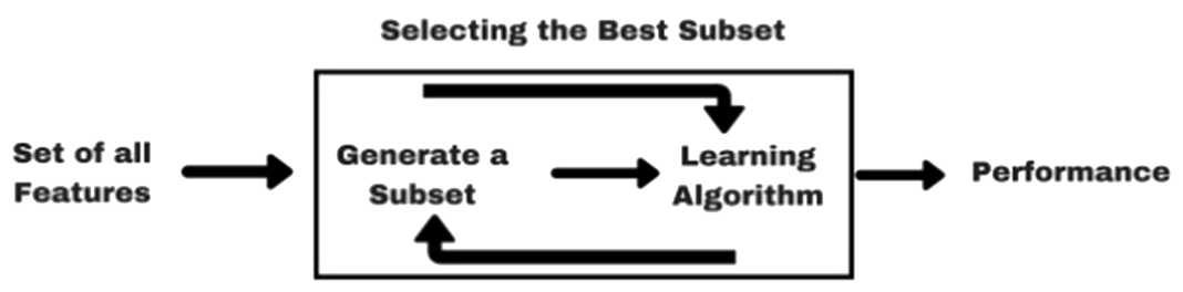
- Embedded methods
Embedded methods learn which features best contribute to the accuracy of the model while the model is being created. The most common type of embedded feature selection methods are regularization methods.
Dimensionality reduction
Dimension reduction, the process of converting a set of data having vast dimensions into data with lesser dimensions ensuring that it conveys similar information concisely.
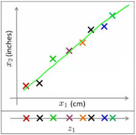
For example, as shown below, the points on the two dimensional plane ($x_1, x_2$) could be represented along on a one dimensional line ($z_1$).
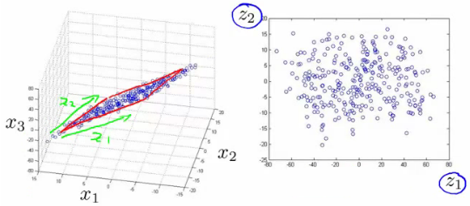
Also, in the following example, points in the 3D space ($x_1, x_2, x_3$) can be converted into a 2D plane ($z_1, z_2$) with little information lost.
- Common methods for Dimension Reduction include:
- Decision Trees
- Random Forest
- High Correlation
- Factor Analysis
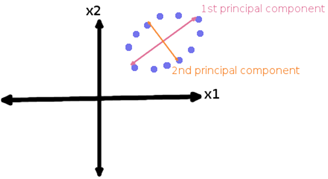
- Principal Component Analysis (PCA)
In PCA, variables are transformed into a new set of variables, which are linear combination of original variables.
Difference between Feature Selection and Dimensionality Reduction
Both Feature Selection and Dimensionality Reduction seek to reduce the number of attributes in the dataset. A dimensionality reduction method does so by creating new combinations of attributes, and Feature selection methods include and exclude attributes present in the data without changing them. While, you may also find, in some articles, feature selections have been treated as a type of dimension reduction method.