-
Using Styles to Enhance the Appearance of Graphical Components
Styles and “Drawables” can be combined to help you to define the appearance and style of specific graphical components.
Styles
A style in Android is a collection of attribute/value pairs applied to a view. A style is a xml resource and it separates the design attributes from XML layout. Styles in Android is similar in concept to CSS on web because it separates design from the content. For example, your styles.xml file should look similar to this:
<style name="…">
    <!-- Customize your theme here. -->
    <item name="…">…</item>
    <item name="…"> …</item>
    <item name="…"> …</item>
</style>
Theme
A Theme is a Style that applies to the entire application or a certain Activity.
Colours
You can define your “own” colours. Create an xml file called colours in the values folder of your Android project and create entries in colors.xml as resources. Once you choose the colours you want to use, then update the values in res/values/colors.xml.
-
Appearance
You can then define the appearance of a graphical component. Create a folder called drawable. Within this folder create an xml file with an appropriate name for the appearance that you want to create, say red_menu_btn1.xml. You can use the shape tag in conjunction with the item tag to specify specific features of the appearance, for example:
red_menu_btn1.xml
<?xml version="1.0" encoding="utf-8"?>
<selector xmlns:android="http://schemas.android.com/apk/res/android" >

    <item>
        <shape>
		\\ description tags
        </shape>
    </item>
</selector>
Example item tag
You can specify the appearance when in a particular “state”. In this case we will apply it to a button which can be pressed. This could allow you to change the entire “look & feel” of a button in one click. The code below changes how the colour of a button is displayed when clicked.
<item android:state_pressed="true">
</item>
Example shape tags
You can set image related attributes by defining shape drawables in xml and then them use as resources in java code and xml to set image related attributes. For example, to define the gradient of a shape then you could use a gradient element allows you to set start colour and end colour, stroke, corners and padding, gradient type and angle, as shown on a sample code below.
<shape> <gradient android:startColor="@color/red_gradientS" android:endColor="@color/red_gradientE" android:angle="270"/> <stroke android:width="1dip" android:color="@color/red_stroke"/> <corners android:radius="3dip"/> <padding android:left="10dip" android:right="10dip"/> </shape> -
Style Creation
- A style resource is used to define the format and look for a User Interface (UI). You can apply a style to:
- An individual View
- An Entire Activity
A style or theme can be created by adding a <style> element with a unique name that identifies the style and then add an <item> element to define each of the style attributes. To do these you will have to open res/values/styles.xml file of your project. So, first you could define the style and set drawable background colour as in the following example:
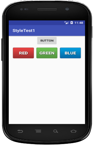
<Button
       android:id="@+id/button4"
       android:background=
       "@drawable/blue_menu_btn1"
       style="@style/main_menu_btnNormal1"
       android:text="Blue"
/>
And later have the code to specify the name of each item elements and its attribute
<resources>
     <style name="main_menu">
        <item name="android:layout_width">fill_parent</item>
        <item name="android:layout_height">55dip</item>
        <item name="android:textColor">@color/menu_text_color</item>
        <item name="android:gravity">center</item>
        <item name="android:layout_marginLeft">45dip</item>
        <item name="android:layout_marginRight">45dip</item>
        <item name="android:textSize">30sp</item>
        <item name="android:textStyle">bold</item>
        <item name="android:shadowColor">@color/menu_shadow_color</item>
        <item name="android:shadowDx">1</item>
        <item name="android:shadowDy">1</item>
        <item name="android:shadowRadius">4</item>
    </style>
</resources>
Applying to a view
Then, the above defined style can be applied to the entire activity/application or an individual view using textview. So, you could write custom java class or apply to individual style like:
<TextView

style="@style/myStyle"

/>
At Design Time
You can apply that specified style at design time by adding the following sample code:
<Button
    android:id="@+id/button2"
    android:background="@drawable/red_menu_btn1"
    style="@style/main_menu_btnNormal1"
    android:text="Red"
    />
Or at Run Time using:
Resources res = getResources();
Drawable shape = res. getDrawable(R.drawable.gradient_box);

TextView button2 = (TextView)findViewByID(R.id.button2);
button2.setBackground(shape);
-
Simple Borders
Simple borders can be added by setting a shape drawable (a rectangle) as background for the view and put the rectangle drawable topbottom.xml and sides.xml into res/drawable folder. You can then set a solid colour background in the theborder.xml by using @android:color="#... " and use padding to separate the text from the border.
So, first you will need to use a shape drawable theborder.xml and then set stroke, padding and corners as shown in theborder.xml, topbottom.xm and sides.xml
Drawable theborder.xml
<layer-list xmlns:android="http://schemas.android.com/apk/res/android" >
<item>
     <shape xmlns:android="http://schemas.android.com/apk/res/android">
    	<stroke android:width="1dp" android:color="#55771B" />
    	<padding android:left="17dp" android:top="13dp"
                              android:right="17dp" android:bottom="17dp" />
            <corners android:radius="14dp" />
     </shape>
</item>
</layer-list>
Drawable – topbottom.xml
<layer-list xmlns:android="http://schemas.android.com/apk/res/android">
    <item>
        <shape android:shape="rectangle">
            <stroke
                android:width="2dp"
                android:color="#e10606" />
            <solid android:color="#9bce64" />
        </shape>
    </item>

    <item
        android:bottom="2dp"
        android:top="2dp" >
        <shape android:shape="rectangle">
            <stroke
                android:width="2dp"
                android:color="#9bce64" />
        </shape>
    </item>
</layer-list>
Drawable – sides.xml
<layer-list xmlns:android="http://schemas.android.com/apk/res/android"> <item> <shape android:shape="rectangle"> <stroke android:width="2dp" android:color="#e10606" /> <solid android:color="#9bce64" /> </shape> </item> <item android:end="2dp" android:start="2dp" > <shape android:shape="rectangle"> <stroke android:width="2dp" android:color="#9bce64" /> </shape> </item> </layer-list> <TextView android:layout_width="fill_parent" android:layout_height="wrap_content" android:text="@string/hello" android:background="@drawable/theborder“ /> -
Ambient Computing and the Mobile Platform
Ambient computing involves transformation of computing devices (IoT devices) by using existing technologies to create interconnected intelligent systems that enables communications between these devices without human interaction. The ambient computing address issues of interface design and interaction arise from ubiquitous computing and Pervasive computing. We looked at Ubiquitous computing and Pervasive computing on week 2 presentation, this presentation will cover Ambient computing.
- The vision is to provide:
- Computers Everywhere
- Computers in Every Object
- Computer Services can be accessed at any time and in any place
- Action/Activities feeding data into a computer
- Visual representation of changing data
Intelligent Cities
- Advanced development of ambient computing led many cities around the world such as Singapore, Edinburgh, Glasgow, London and many others around the world uses intelligent systems and architectures transforming them intelligent(smart) cities. The purpose is to for assist in the making of real-time decisions by enhancing communications, availability and accessibility of information at anywhere and at any time including:
- Face recognition
- Voice recognition
- Monitoring of air quality
- Chemical Sensors in phones!
Interactive Art
Interactive art is a form of art that involves the participation of a spectator in a way that allows the art to achieve its purpose, a good example of this is the “Cloud” and the Source which is a three story high kinetic sculpture. The “Cloud” is a “Persuasive” Device, pressure sensors monitor footfall at entrance to each lift and on each staircase.
The Source
This is a kinetic sculpture at the London Stock exchange which represents the movement of stocks and shares.

Figure 2. the Source - Installation at the London Stock Exchange -
Ambient Computing
- As discussed in previous section, ambient computing:
- Present a small amount of information
- Use sensory output
- Colour
- Sound
- Changing picture
- Single device
- Unobtrusive
- Ambient Computing Examples
- Ambient Room at MIT
- Ambient Orb
- Ambient Umbrella
- Ambient Energy Joule
- Microsoft Whereabouts Clock
Ambient Orb
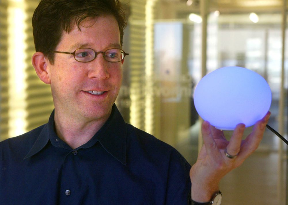
Source: 5 Everyday Objects That Can Now Be Powered By The Internet Energy Joule
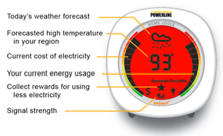
Source: Making energy use visible Whereabouts Clock

Source: An Invention To Find Your Lost One - How do these ideas relate to mobile platform development/ ubiquitous computing?
- Big range of mobile devices that need programming.
- Not just mobile phones
- Sensors are part of many solutions
- Decisions are made as sensor values are combined
- Decisions are made as sensor values are combined
-
Debugging
Debugging Facilities
- There are a number of programming and “IDE” facilities available to you as a developer. These include:
- System.print statements
- Log.e statements e.g. Log.e(“My Tag”, “Inside on create”);
- Setting breakpoints and viewing the state of variables and objects in a watch window