-
Menus in Android
“Menus are a common user interface component in many types of applications. To provide a familiar and consistent user experience, you should use the 🔗 Menu APIs to present user actions and other options in your activities.” Android Documentation, see the link below for greater detail:
🔗 http://developer.android.com/guide/topics/ui/menus.html
- Android supports 2 types of Menus. We will examine each in turn and look at how we can make use of them in an application.
- Options menu
- Context menu
Android OS versions
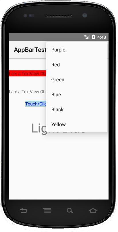
The 🔗 options menu is the primary collection of menu items for an activity. It's where you should place actions that have a global impact on the app, such as "Search," "Compose email," and "Settings". If you are developing for Android 2.3 or lower, users can reveal the options menu panel by pressing the Menu button.
On Android 3.0 and higher, items from the options menu are presented by the 🔗 action bar as a combination of on-screen action items and overflow options. From Android 3.0 onwards, the Menu button is deprecated (some devices don't have one). So if you are targeting Android 3.0 and above you should use the action bar to provide access to actions and other options.
-
Options Menu
An options menu is intended to display information to the user that is related to the current activity. In Android you activate the options menu by “pressing” the menu key.
To specify the options menu for an activity, override onCreateOptionsMenu(). In this method, you can inflate your menu resource (🔗 defined in XML) into the 🔗 Menu provided in the callback.
Context Menu
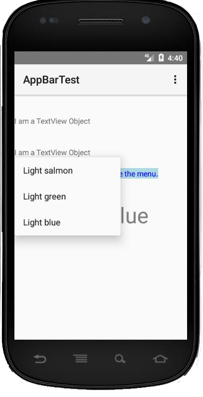
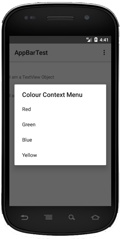
A context menu is intended to display information related to a particular view of an activity. In Android to activate a context menu you press and hold on it.
A context menu is a 🔗 floating menu that appears when the user performs a long-click on an element. It provides actions that affect the selected content or context frame.
When developing for Android 3.0 and higher, you should instead use the 🔗 contextual action mode to enable actions on selected content. This mode displays action items that affect the selected content in a bar at the top of the screen and allows the user to select multiple items.
-
Action Bar
The action bar is a dedicated area at the top of each screen. Normally this area stays there throughout the app.
- It provides several key functions:
- Makes important actions prominent and accessible in a predictable way (such as New or Search).
- Supports consistent navigation and view switching within apps.
- Reduces clutter by providing an action overflow for rarely used actions.
- Provides a dedicated space for giving your app an identity.
Tool Bar/Action Bar
Beginning with Android L (API level 21), the action bar may be represented by any Toolbar widget within the application layout. The application may signal to the Activity which Toolbar should be treated as the Activity's action bar. Activities that use this feature should use one of the supplied. NoActionBar themes, set the 🔗 windowActionBar attribute to false or otherwise not request the window feature.
Toolbar
A Toolbar is a generalization of an action bar for use within application layouts. While an action bar is traditionally part of an 🔗 Activity's opaque window decor controlled by the framework, a Toolbar may be placed at any arbitrary level of nesting within a view hierarchy.
So if the Toolbar is located at the top of the app we effectively have the equivalent of an Options menu on the Action Bar.
-
Using the Toolbar
In the manifest file add:
<application
    android:allowBackup="true"
    android:icon="@mipmap/ic_launcher"
    android:label="@string/app_name"
    android:roundIcon="@mipmap/ic_launcher_round"
    android:supportsRtl="true"
    android:theme="@style/Theme.AppCompat.Light.NoActionBar"
 >
Or alternatively create a style entry in styles.xml in the values folder:
<resources>

<!-- Base application theme. -->
<style name="AppTheme" parent="Theme.AppCompat.Light.NoActionBar">

</resources>
Creating Menus in Android
To demonstrate the creation of menus in Android we will develop an app which will change the background colour of the currently running application.
Creating an Options Menu
First you will need to create an Android project in Android Studio, then create an xml file called mainmenu.xml as a subfolder of res in your Android project like the one shown below:
mainmenu.xml
<menu
		xmln:android=“ …………………..”
>
	<item
		android:id=“@+id/red”
		android:title = “Red”
	/>
				etc.
</menu>
-
Activity Class
- Within activity class, you will need to define 2 methods with the signatures as shown below:
- public boolean onCreateOptionsMenu(Menu menu)
- public boolean onOptionsItemSelected(MenuItem item)
onCreatOptionsMenu(Menu menu)
MenuInflater inflater = getMenuInflater();
Inflater.inflate(R.menu.mainmenu, menu);

return true;

onOptionsItemSelected(MenuItem item)
switch(item.getItem())
{
	case R.id.red: topView.setBackgroundColor(Color.RED);
			        break;
			// etc.
}
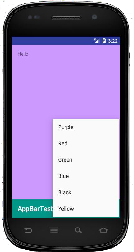
📷 “Options” from the Toolbar which at the bottom of the screen
Create a Context Menu
- You will need to create 2 methods
- public void onCreateContextMenu(ContextMenu menu, View v, ContextMenuInfo menuinfo)
- public boolean onContextItemSelected(MenuItem item)
onCreateContextMenu
super.onCreateContextMenu(menu, v, menuInfo)
menu.setHeaderTitle(Colour Context Menu);
menu.add(0, v.getId(),0,”Red”);
menu.add(0, v.getId(),0,”Green”);
menu.add(0, v.getId(),0,”Blue”);
onContextItemSelected
if (item.getTitle() == “Red”) { topView.setBackgroungColor(Color.RED); } else //etc else return false; return true;Example
See java code in Android project
Popup Menus
A 🔗 PopupMenu is a modal menu anchored to a 🔗 View. It appears below the anchor view if there is room, or above the view otherwise.

Figure 2 Pop Up Menu - PopUp Menus are useful for:
- Providing an overflow-style menu for actions that relate to specific content
- Providing a second part of a command sentence (such as a button marked "Add" that produces a popup menu with different "Add" options).
- Providing a drop-down similar to 🔗 Spinner that does not retain a persistent selection.
X
“Options” from the ToolBar X
“Options” from the Toolbar which at the bottom of the screen X
Figure 1 Context Menu -
Designing usable interactive media
Usability is an important concept whose understanding and accommodation can greatly aid in the production of a high quality interactive media products whether they be for learning, entertainment, or communication.
Usability - the fruits of bad software design
Bad design usually manifests itself as usability problems which is not unique to software systems. "... every object, product, system or service that will be used by humans has the potential for usability problems"1. Computer systems should be designed to be easy to use.
Nielsen's view of usability
- Jakob Nielsen proposed 10 general principles for interaction design called heuristics as they are broad rules of thumb that could be used for usability guidelines. This should have been covered in HCI module recommended booklist, click 🔗 here for an overview. Nielsen suggested the basic notion of usability is that we should make systems:
- Easy to learn.
- Easy to use.
- Contain all the functionality that the users require.
- Important: usability is not a single attribute but a multi-dimensional property of a user interface.
Usability Criteria
Usability criteria can be defined as a “specific objective that enable the usability of a product to be assessed in terms of how it can improve (or not) a user’s performance”2. Usability criteria that are mostly used includes learnability, efficiency and memorability. These can provide some indications as to whether there’s an increase in productivity, or learning.
1 - Preece, J.; Rogers, Y. & Sharp, H (2015). Interaction Design: Beyond human-computer interaction (4th ed). Chichester: John Wiley & Sons.
2- Nielsen, J. (1993). Usability Engineering, Academic Press: San Diego.
-
Usability Heuristics
As previously discussed, these were proposed by Jacob Nielsen as general rules of thumb that could be used as usability guidelines when designing interactions. For example, Learnability, efficiency, memorability, errors, satisfaction, etc. We will examine each in turn and look at how we can make use of them in an application.
Learnability
Refers to the learning curve of the system. The system should be easy to learn so that the user can rapidly start getting something done. Highly learnable systems have a high initial curve which quickly levels out and hard to learn systems have a shallow curve eventually reaching the same level of expertise as the learnable system.
It is not actually necessary to learn everything about a system as many people happily use systems knowing only a fraction of the commands and functionality available to them.
Efficiency
Efficiency of use refers to the steady level of performance that a user can achieve when they have reached the flatter part of the learning curve. A high level of productivity is possible and a major contributory factor to efficiency and performance is the functionality of a product.
-
Memorability
Memorability refers to how easy a product can enable users to return and use the system after a period of non-use, without having to learn everything again. The intention is to maximise usability whilst minimising cognitive load. As well as novice and expert users, a system may have catered for a third and less common type, namely the casual user. e.g. a multimedia information kiosk, or information repository, or a comparably information-rich Web site. Casual users use systems intermittently and do have previous experience of using the system. Casual users just need to remember how to use the system based on their previous learning and memory of the system or their familiarity with similar systems.
Memorability in a product could be achieved by designing usable interactions to support the overall usability goals, for example, making a system simple to use, making improvements in the systems learnability can make an interface easier to remember.
-
Errors
System should have a low error rate and if errors do occur they should be easily recoverable. An error can be defined as an action which does not accomplish the desired goal [Macauley]. Systems should be designed in such a way that they allow users to make as few errors as possible. Provide meaningful and helpful error messages informing the user of the exact problem and its effects. Courses of action and remedial steps should be provided to reverse the error. Leaving the user who is confused with an unhelpful error message will detract from the system's usability.
Satisfaction
System should be pleasant to use so that the user is subjectively satisfied when they are using it. Satisfaction is a particularly difficult factor to specify, though it’s very important to multimedia application areas such as games and infotainment packages. Some users may find a system which provides large amounts of functionality and high levels of performance a satisfying product. Others may be satisfied with a system if they have fun using it, and it provides them with entertainment. A satisfied and happy user is more likely to continue using a package.
-
ISO definition of usability
"Usability is the effectiveness, efficiency and satisfaction which specified users can achieve specified goals in particular environments. Effectiveness is the accuracy and completeness with which users achieve specific goals. Efficiency is the accuracy and completeness of the goals achieved in relation to the resources expanded. Satisfaction is the comfort and acceptability of using the system."
HCI and the role of usability
- In designing any tool, we must consider issues such as:
- Functionality (will the design perform the task it’s supposed to).
- Costs (will the design be achievable with the available resources).
- Aesthetics (will the design look good to the potential user).
- Usability (how easy is it to learn and use, how engaging and satisfying is it).
All these issues are important and have interacting effects e.g. increasing the usability will also increase the cost to the producer. Previously computer systems have over-emphasised the functionality and cost aspect of design to the detriment of usability. However, ease of use of a piece of software has become as much a selling point as functionality.
Multidisciplinary teams are employed to improve usability. Computer is unique as a tool in that it has a hardware and software component both of which affect the overall usability.
- The design of usable software is very much affected by:
- Availability of appropriate hardware;
- Design of hardware is in turn affected by a number of outside factors.
-
Usability heuristics
A user interface is literally the main point at which a computer system and a user interact. It allows the user to observe information, enter data, and generally interact with the device hardware and software. Design and development of user interfaces is demanding and difficult, encompasses so many factors.
Nielsen's usability heuristics
- Nielsen1 suggested ten heuristics as outlined below to cover screen design (graphical & text) that provide the basis for a systematic inspection of user interfaces to find usability problems.
- Simple and natural dialogue. Dialogues should not contain information that is irrelevant or rarely needed.
- Speak the users' language. The dialogue should be expressed in terms, words and phrases familiar to the user.
- Minimise users' memory load. The user should not have to remember information from one part of the dialogue to another.
- Consistency. Users should not wonder whether different words, situations or actions mean the same things.
- Feedback. The system should always keep the user informed as to what is going on.
- Clearly marked exits. Users often incorrectly select functions; hence they need clear exits for them to use without complex dialogue.
- Shortcuts and accelerators. Allow expert users to speed up interaction.
- Good error messages. They should be expressed in plain language to specify the problem and suggest a course of action.
- Prevent errors. Better than good error messages, prevent a problem from happening in the first place.
- Help and documentation. Information which is easy to search, focused on the current users' task (context sensitive), lists courses of action, and concise.
1. Nielsen J. (1994) Enhancing the explanatory power of usability heuristic. In Proceedings of ACMCHI’94 PP152-158
-
- 🔗 Linda Macaulay1 summarises Nielsen's heuristics into five categories as discussed below. Macaulay's approach is to see the interface from the user's point of view. User will perceive the interface as a whole entity, rather than focusing on specific points.
- Naturalness.
- The main consideration here is the dialogue between the user and the computer.
- Consistency.
- Non-redundancy.
- Non-redundant dialogue requires the user to input the minimum amount of information for the system to operate.
- Supportiveness.
- The amount of assistance and help the system provides the user during the running of the system.
- The quality and quantity of error and confirmation messages and general help and instructions.
- Flexibility.
- A flexible system will be able to cater for all types of user. Variations in experience, knowledge, skill, intelligence etc. must all be catered for.
🔗 http://citeseerx.ist.psu.edu/viewdoc/download?doi=10.1.1.433.4515&rep=rep1&type=pdf
-
- Carl Zetie1 proposed four main fundamental principles of user interface design and recommended viewing the interface from the system's standpoint, particularly when developers are more concerned with specific technical and logical matters rather than general observations about the interface. The proposed principles of user interface design are:
- Visibility.
- Visibility is a description of how easily and directly the user can see what can be done and how to do it.
- Feedback.
- This is a measure of how quickly and easily you can determine the results of your actions.
- Mappings.
- A mapping is a description of the function desired by the user and the actions required to achieve it.
- Cues and affordances.
- A cue is the utilisation of the users’ knowledge to hint and suggest what a control or window is used for.
- The affordance of a control or window is where the user expects a particular action to be performed.
Alan Dix2 on the other hand suggested a more thorough analysis of the main factors affecting screen design and implementing three main principles to achieve this.
- Three main principles.
- Learnability - This is the ease in which new users can begin effective interaction and achieve a satisfactory level of performance. This incorporates:
- predictability;
- synthesizability;
- familiarity;
- generalizeability;
- consistency.
- Flexibility – deals with multiple ways in which the user and the system exchange information, incorporating:
- Dialogue initiative;
- Multithreading;
- Task migratability;
- substitutivity;
- Customisability.
- Robustness - the level of support given to the user to determine successful achievement and assessment of goals, involving:
- observability;
- recoverability;
- responsiveness;
- task conformance.
1 - 🔗 https://trove.nla.gov.au/work/21390051?selectedversion=NBD11797024
2 - 🔗 https://www.interaction-design.org/literature/topics/human-computer-interaction
-
Arrogant & Design Approach
The arrogant design approach is characterised by the designer thinking they (always!) know best; that problems with the systems are due to ignorant users; problems can be reduced by better selection or training of the user. The arrogant designer is interested primarily in functionality, they focus on the technology and they regard user interface design as a matter of common sense.
The Informed design approach will readily consult others on their design (e.g. HCI specialists, users, graphics designers) when they see problems occurring due to design faults. The problems are then reduced by testing and changing designs.
The informed design approach has an equal interest in usability and functionality, even aesthetics, and they focus on the total environment within which a system is used and they see user interface design as involving specialist skills and knowledge.
- In support of the informed approach to design. The following paragraphs presented in tab 7.15 summarises two views of the tasks and one all-embracing model advocated by usability workers. Gould and Lewis1 recommended a general approach where three global strategies are incorporated:
- Early focus on users and tasks.
- Empirical measurement.
- Iterative design.
1- 🔗 http://citeseerx.ist.psu.edu/viewdoc/download?doi=10.1.1.84.8860&rep=rep1&type=pdf
-
- Neilsen as discussed on previous section has specified the following 10 usability tasks, which expand on Gould and Lewis's three principles. Again they are only loosely related to systems design processes.
- Know the user.
- Competitive analysis
- Setting usability goals.
- Participatory design.
- Coordinated design of the total interface.
- Guidelines and heuristic analysis.
- Prototyping.
- Empirical testing.
- Iterative design.
- ollect feedback from users.
The focus here is split between focus on the needs of the designer, and on the needs of the user which provides an overview of comprehensive checklist for usability engineering which is perhaps a little biased to UI concerns. Expands on the ordering and positioning of the usability tasks identified by Nielsen and others give developers precise positions in a traditional (linear) development lifecycle. For example, in terms of:
- Scoping
- Project plan.
- User profile.
- Hardware/software definition.
- Functional specification
- Task analysis.
- User interface goal setting.
- Training and documentation definitions.
- Design
- User interface mock-up.
- Style guide.
- Detailed user interface design.
- User interface prototype.
- User interface test plan.
- User interface testing.
- Development
- Development training and documentation.
- User interface test plan.
- Testing/development
- User Interface testing.
- User interface evaluation.
Iterative design is a vital part of usability testing: there is no point in testing and evaluating if there is no intention of going back and re-designing in response to the feedback!